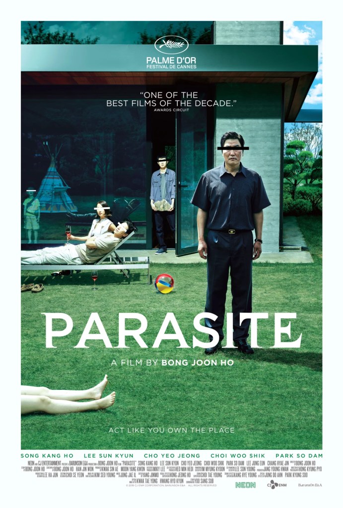
I selected Neon’s release of the Parasite’s movie poster because it captured my attention with the bars covering the characters’ eyes. Eyes are the “soul’s windows.” Why mask some characters in white and others in black? Why mask them? Designed by Kim Sangman, the artwork on that poster is stunning. Directed by Bong Joon-ho, the movie had won a “Palme D’Or.” Unfortunately, I haven’t seen the movie yet. So I am analyzing the poster without the movie’s story and using it as a “visual” foreshadowing technique.
The themes of design include the following:
The poster must have started off with a dot or a point. But the intriguing part is the relationships that start to play off the positioned characters. There is a repetition of lines and colors with respect to the masked/barred eyes. How are the faces with the black lines related? How are the ones with the white lines related? Are they two separate families occupying the same modern-style house? Is the coded-white family not seeing what the black-coded family is doing at that same level within the inside and outside of the house? Is white meant to suggest innocence, light and/or relaxation? Is black suggesting darkness, evil, mischief, or hardship?
The bars seem to vary in length. The man standing up has the longest masked horizontal black line, and the creator seems to make him appear closer to the viewer. Brought more to the forefront, may be the main character? His jawbone and wrinkles indicate to the viewer some sort of a hard life. The teenage boy coming out of the door has the same black-marked eyes as that man. And he is holding some sort of textured rock.
In contrast to that family unit, the couple that is lounging is in a more luxurious dressing with identical white eye bars and white clothing. This suggests to the viewer a more relaxed life, an openness. But in Korean culture, white represent purity and refinement. The lady holding a glass of wine seems to be enjoying life. On that same side of the couple, there is a young boy in the background. He us inside the house. He is dressed in light clothing too. I would expect him to be that couple’s child playing with a teepee.
There is also a use of cropping. On the edge of the photo, a person’s partial legs and feet appear. Is that person sunbathing? Is that person dead and somebody is pulling it out? Or are the feet entering or exiting – implying motion? This technique builds energy and suspense.
There is the rule of thirds in setting the characters’ eyes.
There is the use of shaping – rectangular as well as circular. An example of a rectangular is the boy holding the textured rock object or the grown-up man with the black bar on his eyes. An example of circular is that beach ball. In addition, the house itself has symmetry.
With the blue skies, negative space is created. With the green shrubbery and trees’ landscape, the creator shows a sign of life and order to the viewer. In contrast to that is the darkness inside that home. It tells the viewer there is something going wrong or unseen.
The use of some selected colors is significant. The predominant color is green. It gives a sense of peace, nature, and calmness. In contrast, the grey color gives a sense of something bad happening. The multicolored beachball with a pattern is in the center of the grass. It adds a soft texture, a sense of childhood, balance, and rhythm.
The use of light marks this poster too. The left side is on the brighter side. The right side is on the darker side with less sunlight. Between the inside of the house and the outside backyard, a viewer notices the difference between outdoor light contrasted with the indoor grey-black darkness.
The characters with black-color coding have shoes on. The male character with white-color coding has his shoes off. Could this be an indication as to the owners of this house being the ones on the lounging chairs?
The showing of the teepee, the rock, the bare feet, and the beachball indicates their symbolic importance in the movie. In regard to the teepee, the viewer wonders how this Native American Indian object fits within the movie and its characters’ background. For Native Americans, a teepee is not a toy. Perhaps the movie director is using this Native American imagery to bring light to the Native American culture and way of life.
In sum, this poster is rich visually and textually. Through selected lines, images, objects (rock, teepee), color, contrast, symmetry, dual tones of wealth v. poverty (social status), relaxed v. uptight, sunny v. dark, it makes the viewer want to see the actual film.And with the text placed on the grass, the viewer reads: “ACT LIKE YOU OWN THE PLACE.” Here, the creator is dictating what the viewer should understand about Parasite. One way to find out: Let’s watch the movie!
